PACKAGING AND MERCHANDISING DESIGN – PROJECT 2
Week X – Week X
Feryn Juliesta Sulia (0336407)
Art Direction
Exercises and Projects
LECTURES
Lecture 8: –
17.10.19 (Week 8)
No lecture this week.
No lecture this week.
Lecture 9: –
24.10.19 (Week 9)
No lecture this week, continue working on Project 2
Lecture 10: –
No lecture this week, continue working on Project 2
Lecture 10: –
31.10.19 (Week 10)
No lecture this week
No lecture this week
INSTRUCTION
PROJECT 2
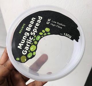
For this project, I was teamed up with Rausha to design a food packaging and its label. Our food product initially was a mung bean cheese, but then it turns out that the product was actually a mung bean spread.
We were introduced to the food science students who made the food product we have chosen to discuss regarding the packaging of the product. Here's the food product information that needs to be on the packaging.
Here are some existing spread packagings in the market;
 |
| Packaging Research |
Before start working on the label and packaging, we built the brand first, there are several brand name and we decided to choose Prouse, here are some logo attempt on Prouse;
 |
| Logo Attempt |
 |
| Logo Development |
 |
| Final Logo |
 |
| First Attempt on Colour Palette |
Here are several label attempts:
 |
| Top label |
 |
| Side label |
 |
| Digital Mockup |
 |
| Moodboard |
 |
| Mockup |
 |
| Mockup |
 |
| Mockup |
We decided to change the look of our label after a few feedbacks, also we were thinking to have some pattern in our label so that it would make our merchandises final project would look interesting and consistent.
Here's our final label precesses;
 |
| Colour Palette |
 |
| Pattern |
 |
| Label Attempt |
 |
| Final Moodboard |
 |
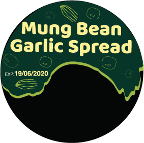
| Top Label |
 |
| Side Label |
 |
| Final Label |
 |
| Label Packaging Mockup |
| Final Packaging |
| Final Packaging |
| FInal Packaging |
FURTHER READINGS
Key Tips for Great Food Label Design for Food and Drink Products – toast
1.) What do you want your label to “say”?
You’re not always going to be able to personally sell your product to your target market, so you need your label to do the talking for you. What type of product is it? Who is it aimed at? How do people use it? What does it taste like? How is it made? What are the ingredients? A good label will portray all these things.
All too often the label design isn’t well thought through and a product remains on the shelf or not stocked by the stores that should be selling it as the core values of the product aren’t communicated effectively and great tasting products are missed.
2.) Style – what should your product look like?
Colours, fonts, images and illustrations all form part of the brand appeal of your product and all should be properly considered. This helps to attract the right audience for your product and gives it more chance of being picked up and bought.
Your target market needs to understand your product and recognise that it’s for them. The overall look and feel of a product is key to it being understood, whether it’s products for children that need to be noticed by parents or an alcoholic product aimed at the real ale market, getting it right can take time and effort but it’s worth it.
3.) Good copy
There’s no underestimating what good copy can do to help sell a product. Quite often the space for copy on a product label is quite limited so it’s important to be efficient with the word count.
It can be a fine art in explaining what a product is in a compelling, creative and attractive way in very few words. If the budget allows it’s always a good idea to enlist the services of a copywriter to produce the wording for your product labels, or at least talk to your design agency about it, as quite often a different perspective works well.
4.) Printing and materials
There are lots of options when it comes to printing your labels and how this affects how your product is perceived. Not all labels have to be glossy, it may be that you want to achieve a more understated look and feel and an uncoated paper with a rougher feel may suit the product and its target audience more.
There are options such as embossing and foil blocking that will also an extra dimension to a product and maybe give it more a luxury feel.
There are many options but it’s important to consider how the label will be printed and feel when handled as it will give the right impression when the product is on the shelves, a designer or printer will be able to talk you through the options.
5.) Creating a range
It may be that you have a range of products, or plan to have a range of products in the future, so it’s vitally important to have brand consistency across all of the labels.
If you’re initially creating one label but plan more, consider what elements will be consistent across the range. If there are to be future flavours for example, what colours would you use and how does that affect the initial design?
Also consider things such as copy space, the area where the product name or description will sit on each label and maybe look to keep it in the same place on each label. Consistency doesn’t have to be too restrictive but it ensures a professional look and feel that builds trust in the product.


Comments
Post a Comment